
A strong brand is not built through a logo alone.
It is built through consistency, recognition, and a clear visual language that connects every brand touchpoint.
This project explores how a minimal identity system can create a distinctive presence while remaining elegant, adaptable, and easy to recognise across different applications.
1. The Problem
The objective was to create a visual identity that feels refined and memorable without relying on excessive decoration or complexity.
The identity needed to communicate professionalism, clarity, and confidence while maintaining the flexibility required for both digital and print communication.
Beyond aesthetics, the goal was to establish a visual foundation capable of supporting long-term brand recognition.
2. The Idea
The identity was built around the interaction of two contrasting letterforms. Rather than treating the initials as separate elements, the concept focused on creating a unified structure where both letters work together as a single visual system.
This approach allowed the mark to remain simple while introducing a distinctive characteristic that makes it easier to recognize and remember.
3. The Direction
Careful attention was given to proportion, balance, line weight, and negative space.
Every element was refined to its essential form, creating a mark that feels elegant, and visually stable.
The resulting structure combines clarity with character, allowing the identity to perform consistently across a variety of applications.
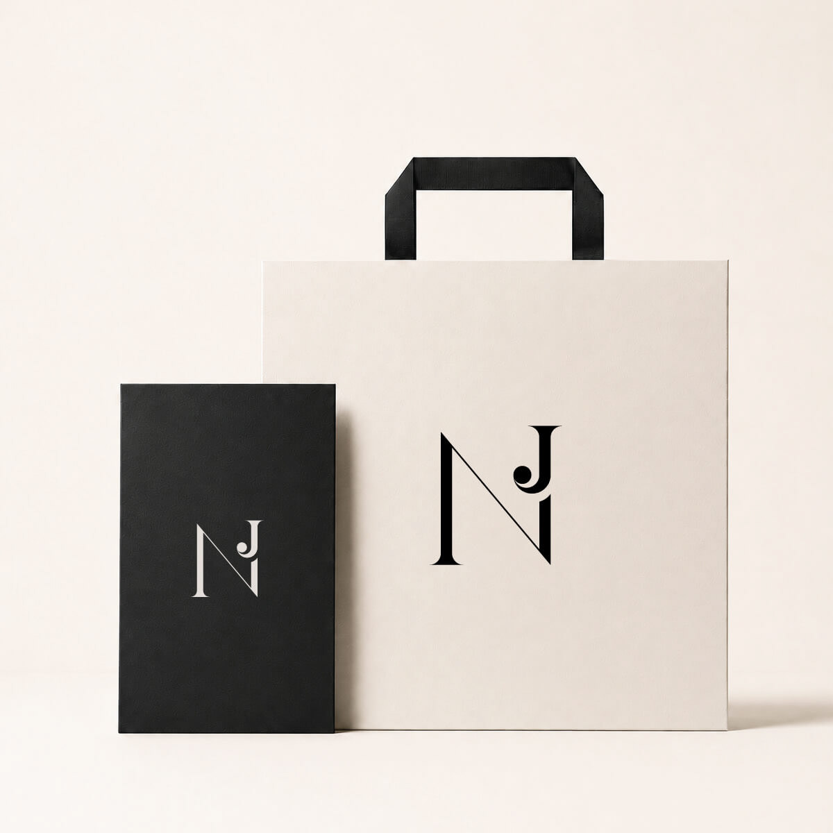
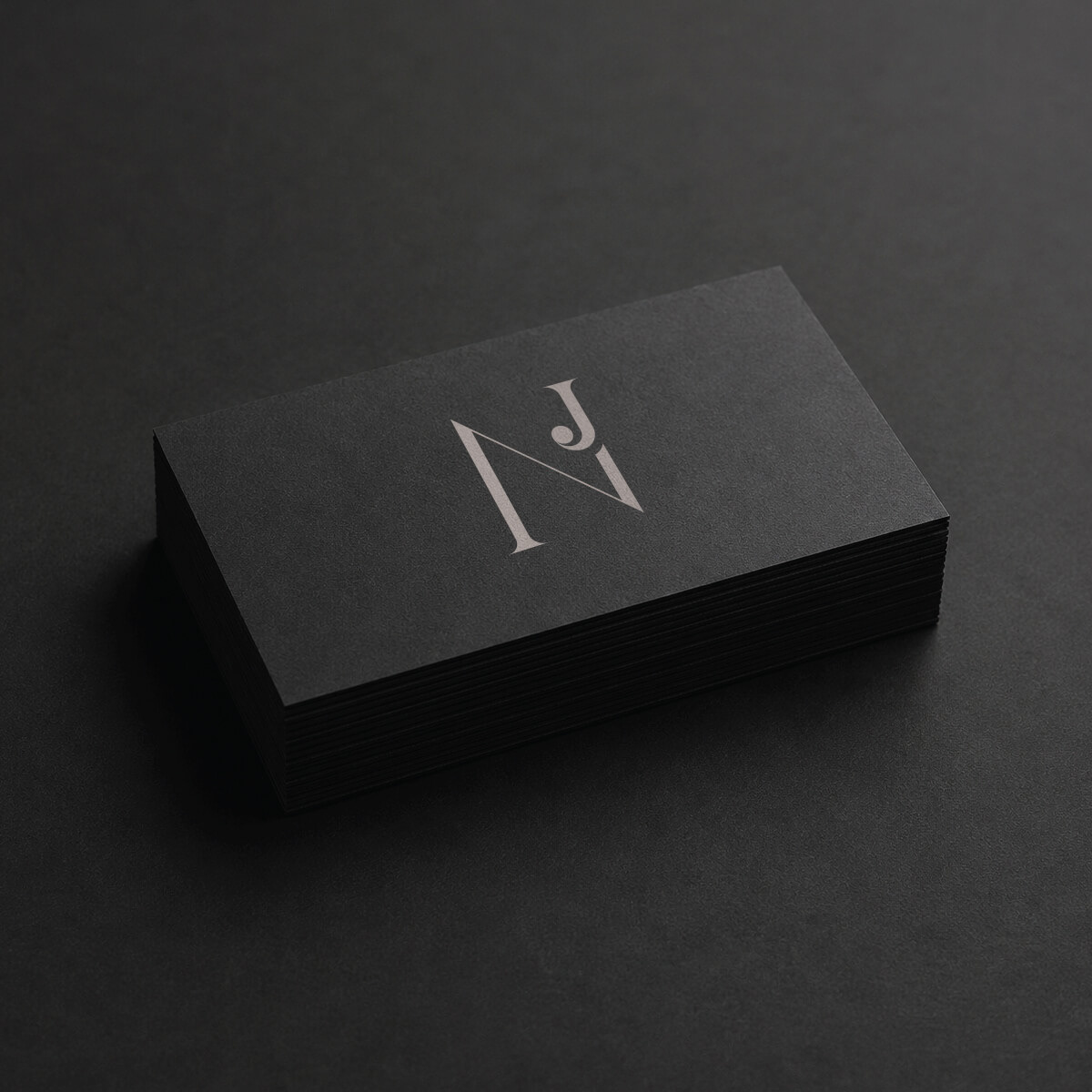
4. Brand Communication
A visual identity extends beyond the logo itself. Business cards, printed materials, digital assets, and future communication pieces all contribute to how a brand is perceived.
The role of the identity is to create consistency across these touchpoints, helping the brand become more recognisable over time.
5. Visual Language
• refined typography
• balanced proportions
• distinctive letter interaction
• visual clarity
• consistency across touchpoints