
Primary Logo
Circular Logo Variation
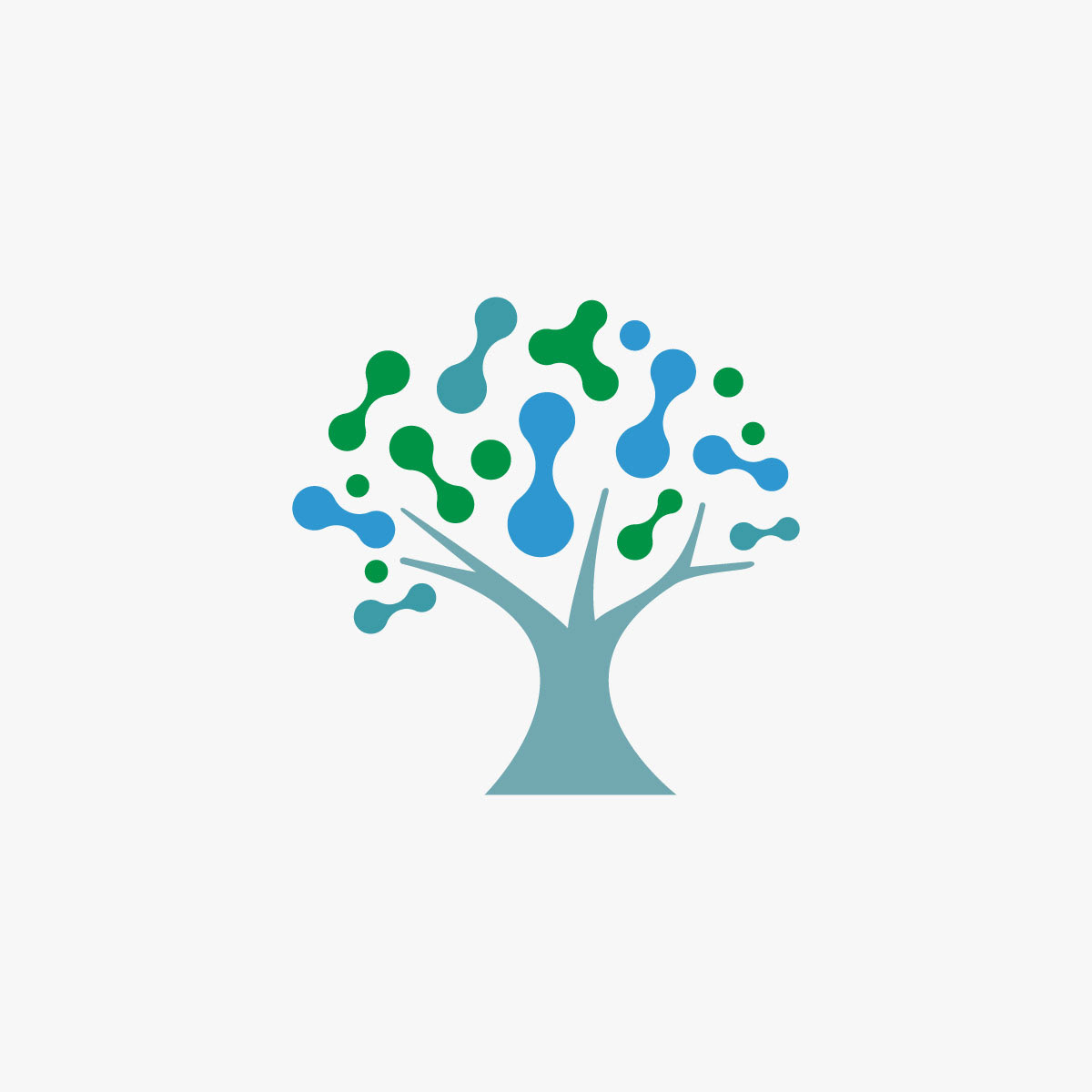
Symbol

Logo geometric construction
Monochrome Logo
Concept
The concept brings together two seemingly different worlds: nature and science.
The tree forms the foundation of the symbol, representing life, growth, resilience and the passage of time. Its branches gradually transform into molecular structures, introducing a visual reference to science, research and innovation.
The result is a symbol where nature and science become part of the same visual idea - reflecting longevity as more than simply living longer, but as the pursuit of a longer, healthier life.
Symbolism
The tree represents the natural side of longevity - growth, resilience and continuity.
The molecular structures introduce the scientific dimension of the concept, connecting the symbol with research, innovation and the biological processes behind healthy aging.Together, these elements create a visual metaphor for the relationship between life and science.
Colour
The colour palette combines blue and green to reinforce the connection between science and nature.
Blue introduces associations of trust, knowledge and scientific thinking, while green brings in vitality, life and natural growth.Together, the colours create a balanced visual language that feels both scientific and human.
Visual Direction
The intention was to create a symbol suitable for an organisation positioned at the intersection of health, science, research and a growing community around longevity.