
Brand Identity

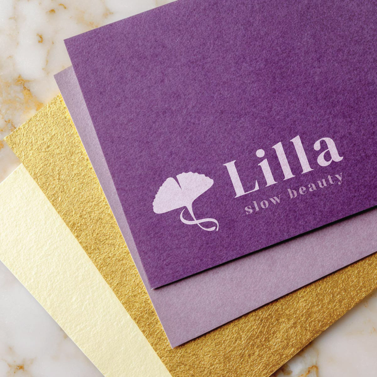
Primary Logo
Monochrome Logo
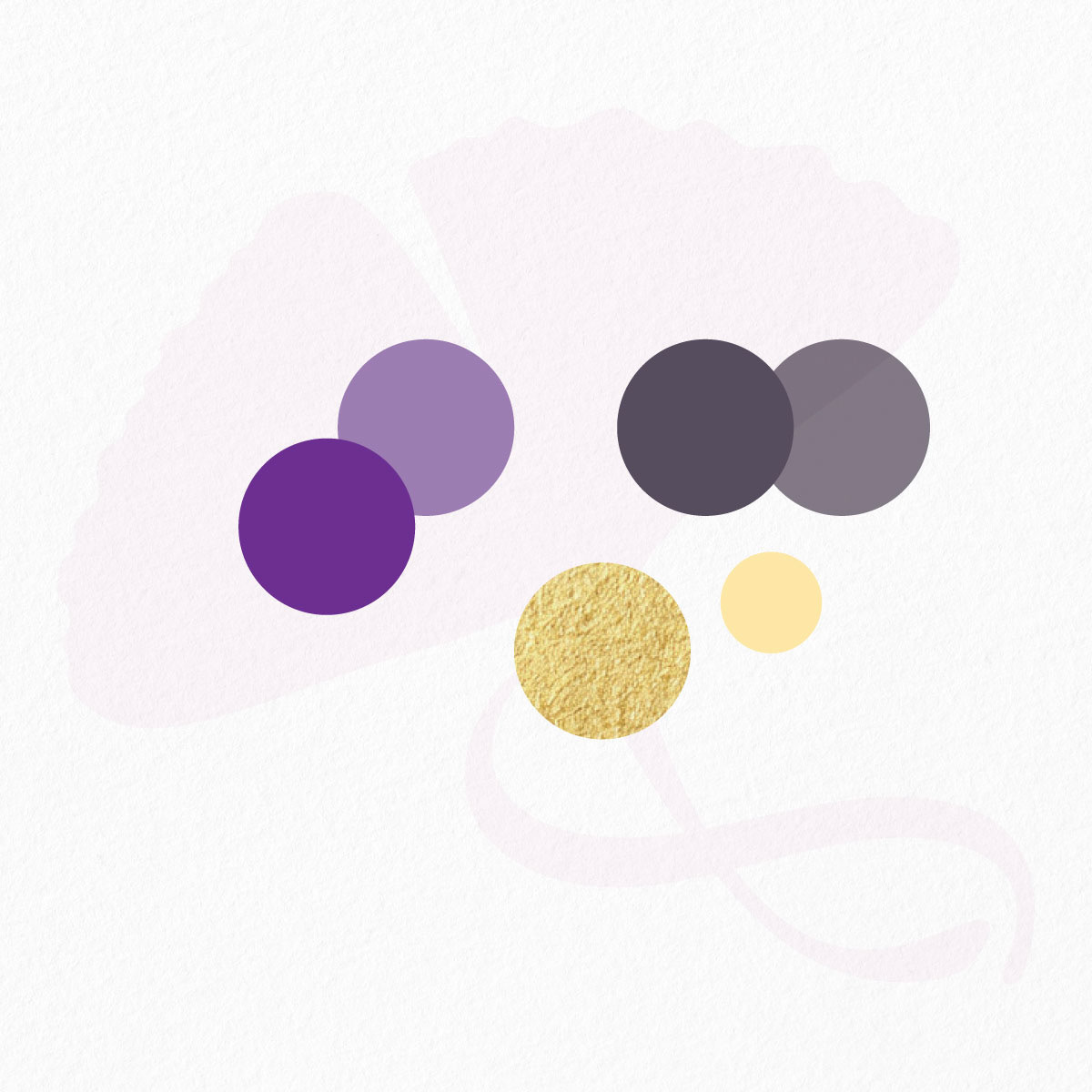
Colour Palette
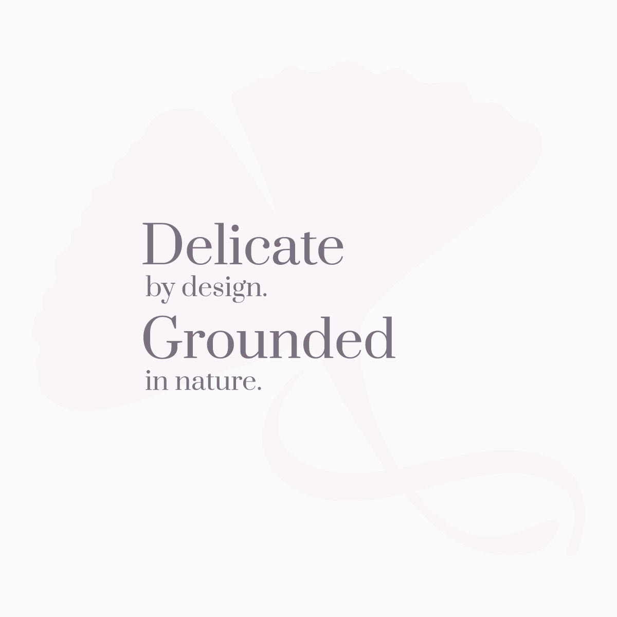
Brand Messaging
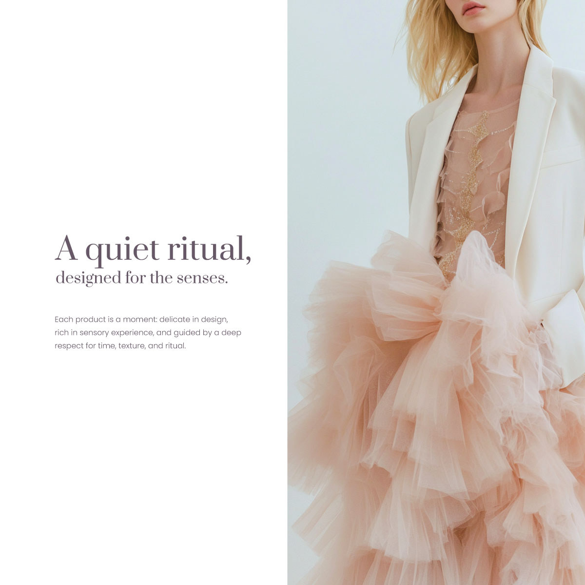
Lifestyle Brand Visual
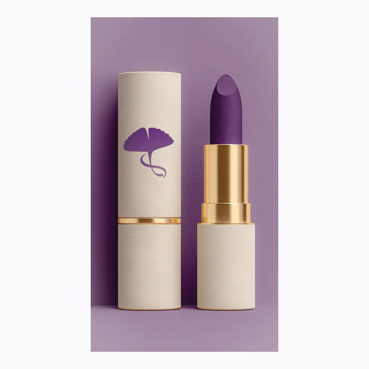
Cosmetic Packaging Design
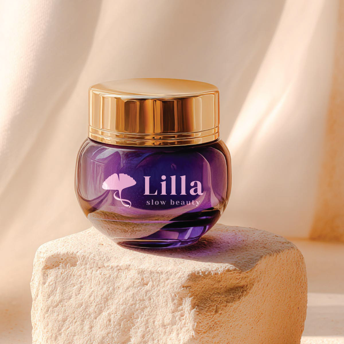
Skincare Packaging Mockup
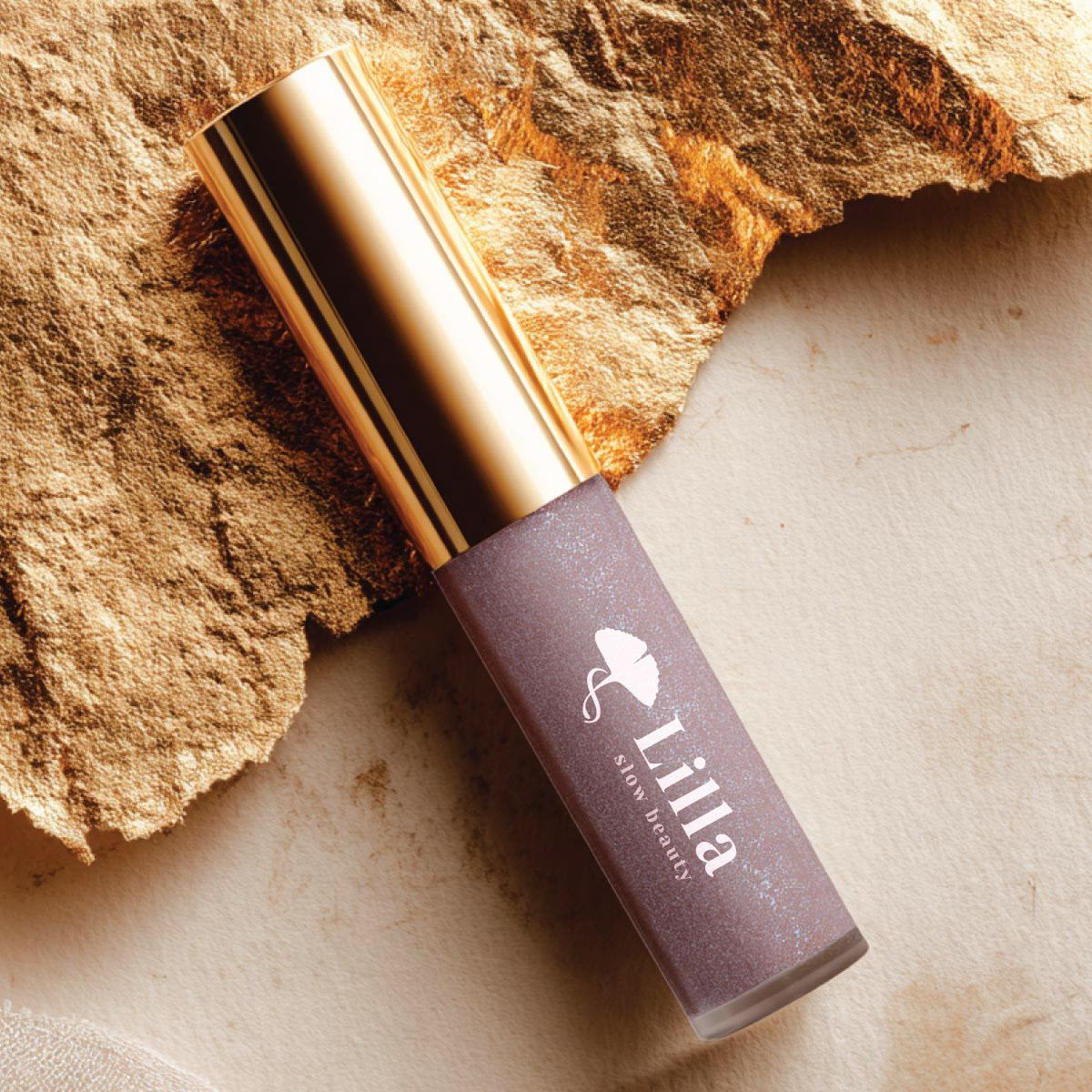
Lip Gloss Packaging
Lilla Slow Beauty was developed as a visual communication concept inspired by calmness, intentional living, and lasting beauty.
Visual Strategy:
The identity combines two symbolic elements:
Ginkgo leaf - an ancient symbol of longevity, strength, and quiet endurance.
Infinity loop - endless cycle of renewal and balance.
Together - a visual union of these elements resonates with the brand’s "slow" philosophy.
Philosophy: Beauty isn’t found in speed, noise, or perfection. It lives in stillness. In thoughtful rituals. In the textures and tones that make you pause. Lilla is more than a beauty brand - it’s a return to softness. A reminder that true beauty grows with time. Lilla Slow Beauty is designed to awaken a sense of: Slowness. Care. Intentional Beauty.
Beyond the Logo:
The project extends beyond a standalone mark into a cohesive visual communication system. The identity was designed to support:
• Packaging design
• Marketing materials
• Social media communication
• Advertising visuals
• Brand storytelling
• Digital and print applications
• Marketing materials
• Social media communication
• Advertising visuals
• Brand storytelling
• Digital and print applications
Through typography, colour, imagery, and symbolism, the system creates consistency across every customer touchpoint.
Communication Direction:
The visual language balances softness and structure.
Delicate forms, restrained colour palettes, and spacious layouts reinforce a feeling of calm confidence while helping the brand remain recognisable across different media.
Available for licensing