
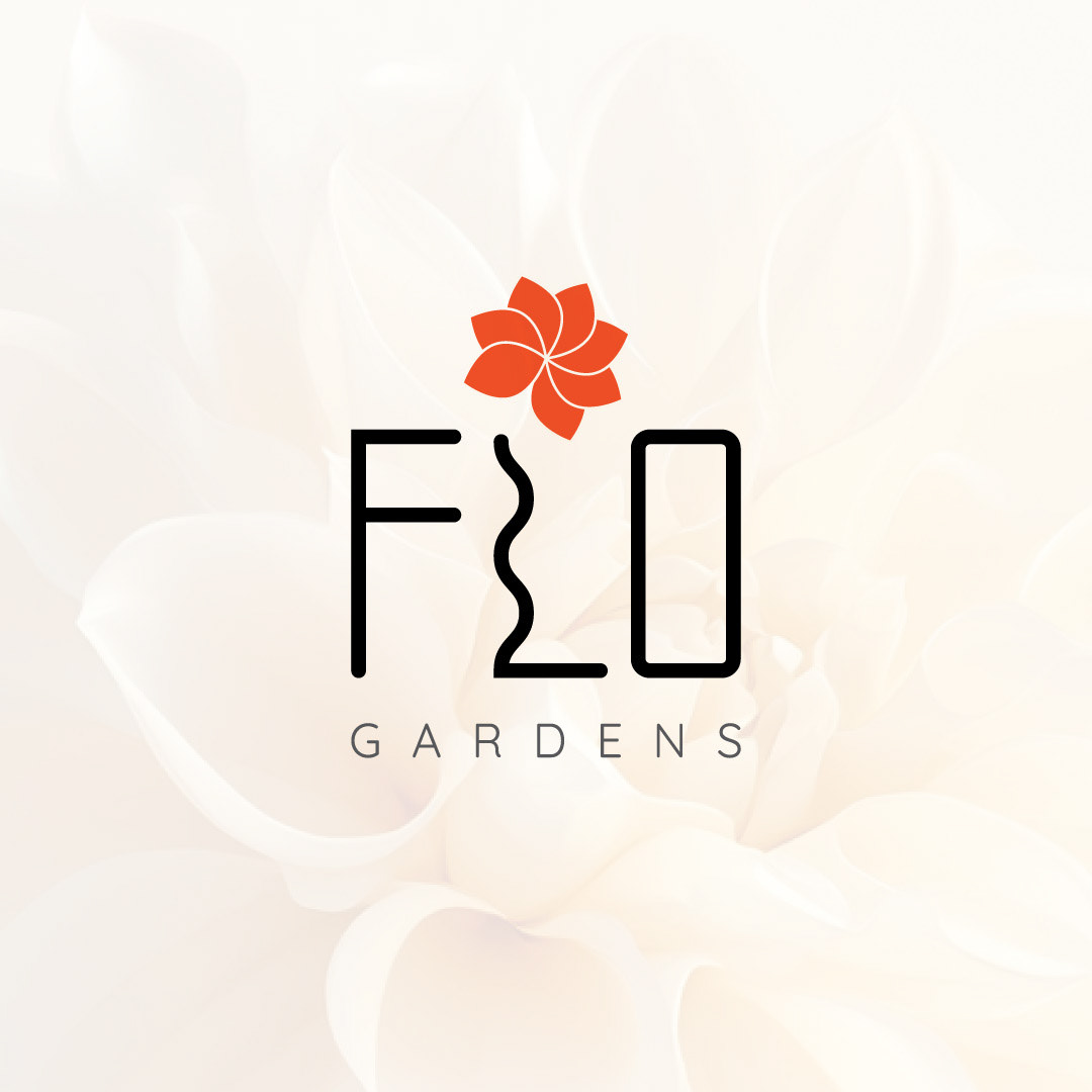
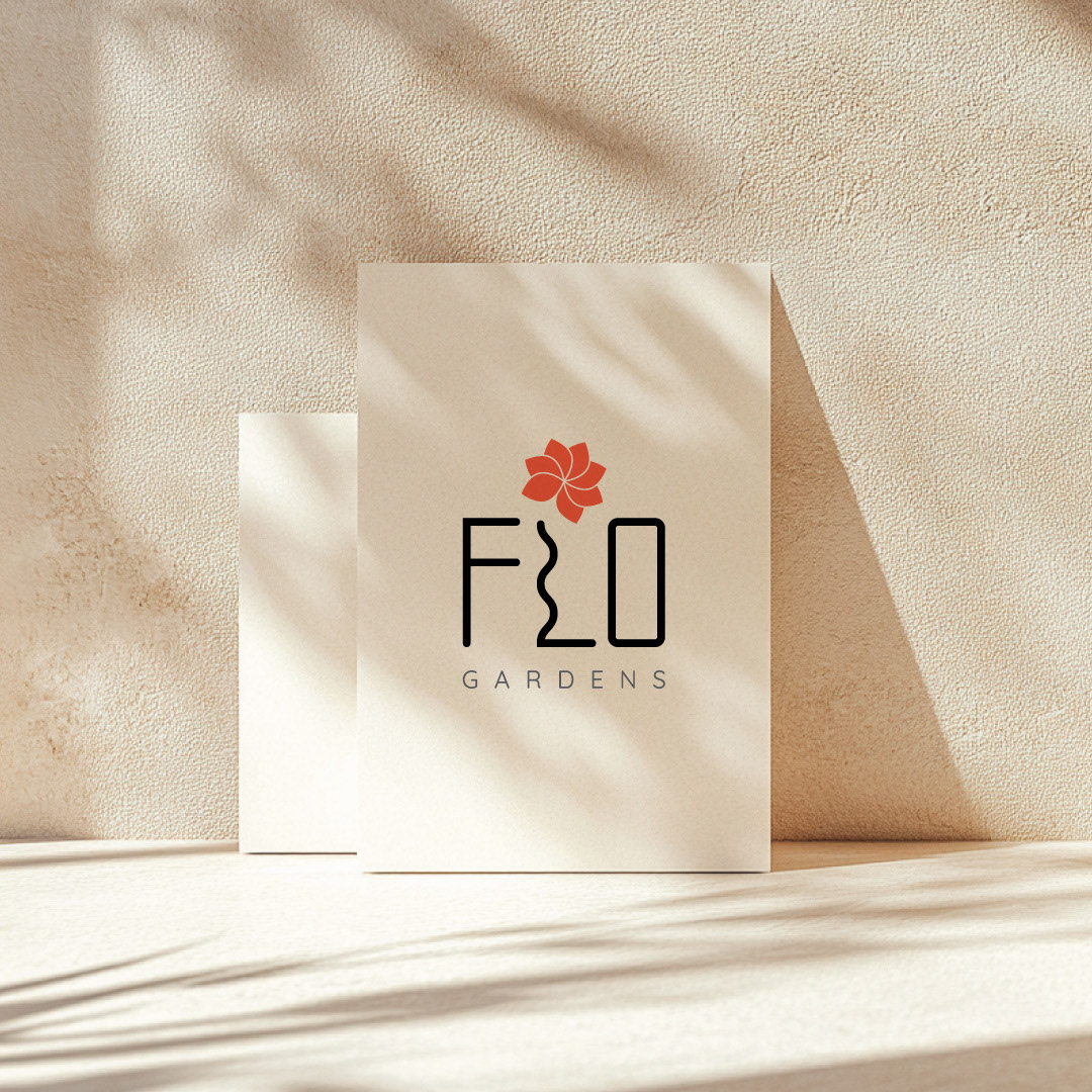
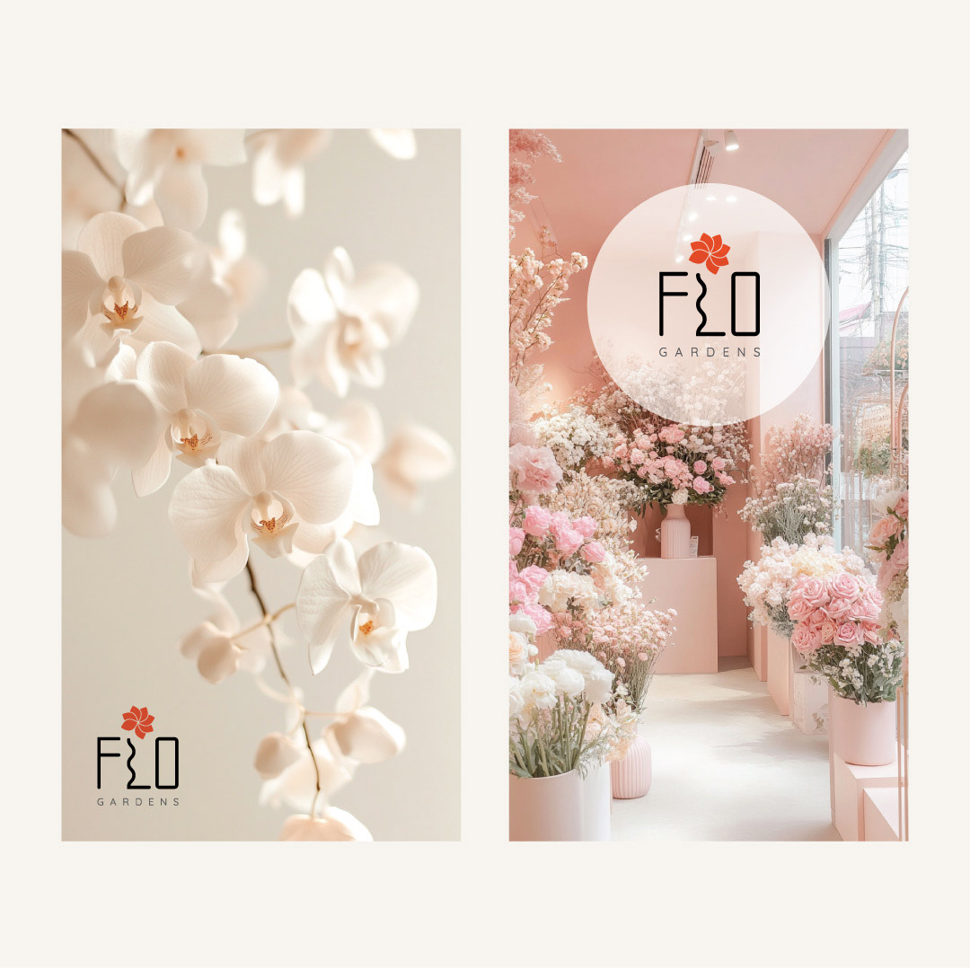
This brand blends minimalist lines with soft organic forms to create a consistent visual presence. The identity was designed to communicate growth, femininity, and grounded elegance across every brand touchpoint.
The logo was built around a feeling - growth, femininity, and grounded elegance - while the wider visual language supports clarity, recognition, and long-term brand consistency.
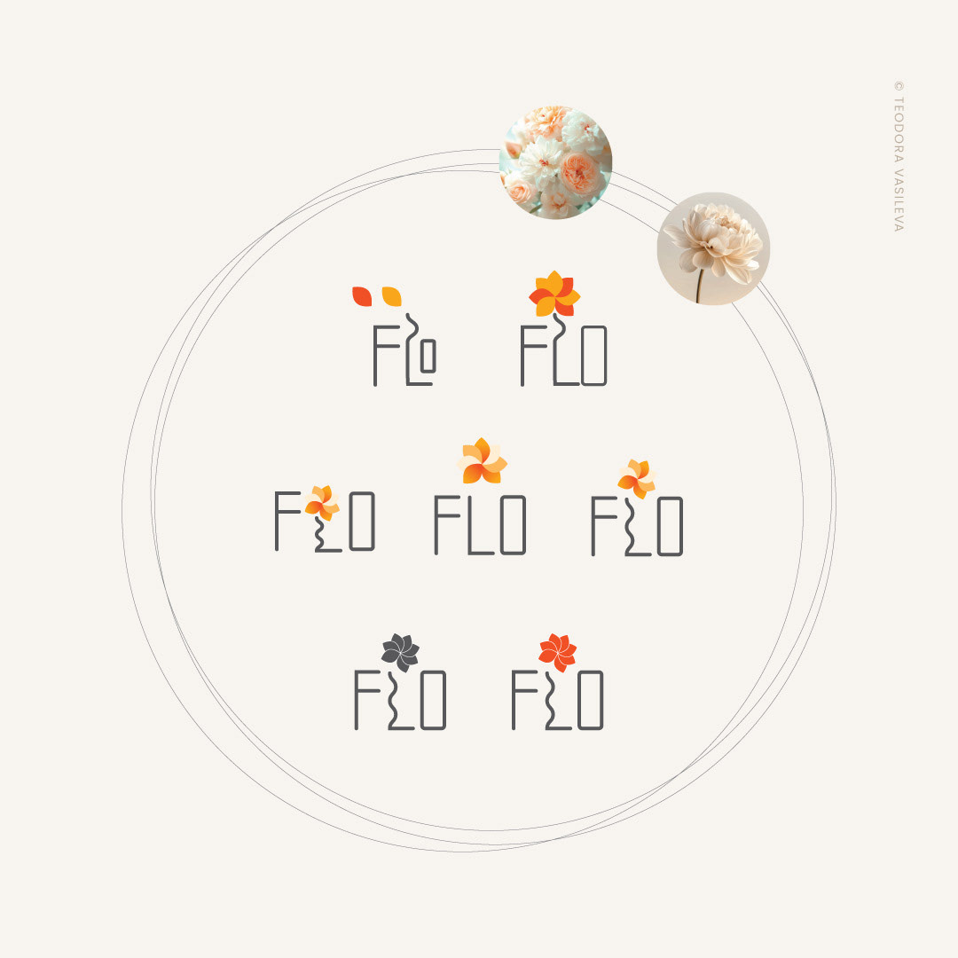
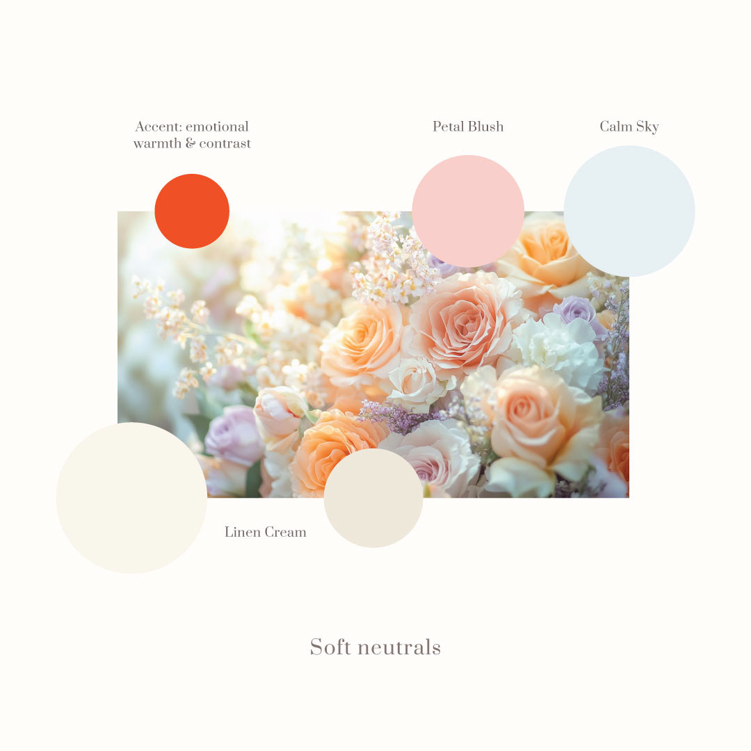
Minimal Lines • Organic Geometry • Soft Branding • Visual Communication
A consistent visual identity helps customers recognise your business faster, builds trust across every platform and makes your marketing more effective over time.
Need something similar?
I can help you with:
• Brand identity
• Logo design
• Brand guidelines
• Social media design
• Print materials
• Packaging
• Logo design
• Brand guidelines
• Social media design
• Print materials
• Packaging