
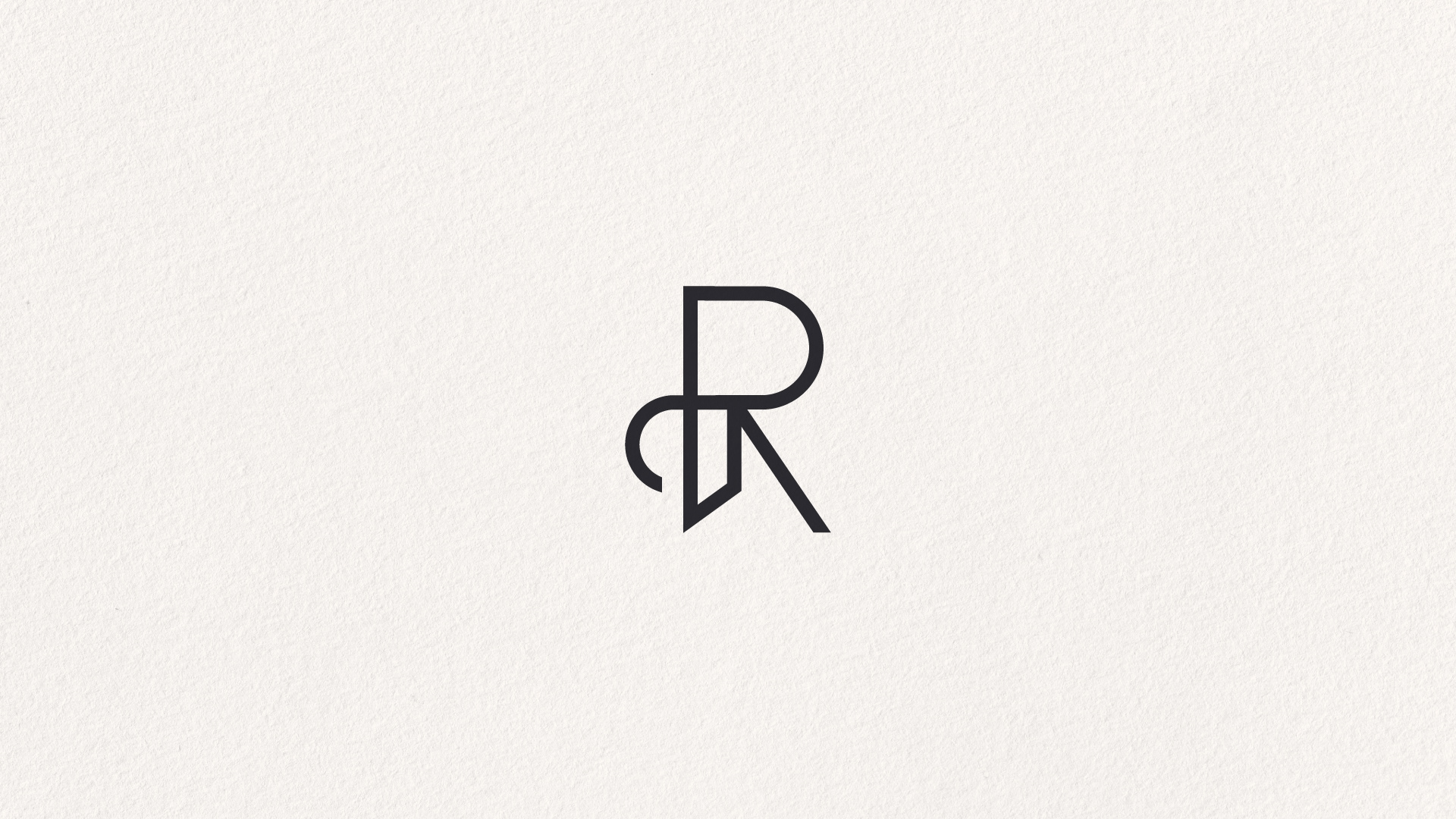
Mark
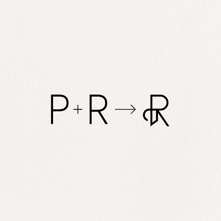
Idea
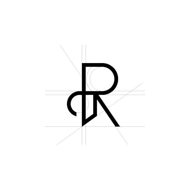
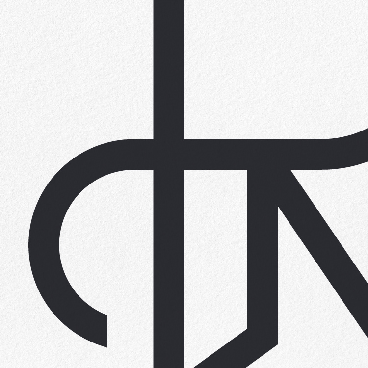
Structure
Mock-up by: #anthonyboydgraphics ❤️
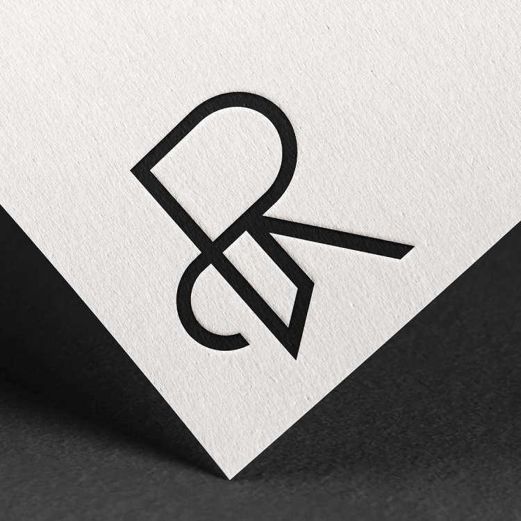
Detail
1. The problem
The challenge was to create a mark that feels minimal, yet distinctive - without relying on decorative elements.
The goal was not to design just a monogram, but to bring two initials into a single, coherent form that feels intentional and balanced.
The challenge was to create a mark that feels minimal, yet distinctive - without relying on decorative elements.
The goal was not to design just a monogram, but to bring two initials into a single, coherent form that feels intentional and balanced.
2. The idea
The concept is based on the integration of the letters P and R into one continuous structure.
Instead of placing them side by side, the focus was on merging them - allowing shared geometry to define the final form.
This approach reduces visual noise and creates a mark that feels compact and controlled.
3. The direction
The design follows a minimal system:
• reduced to essential lines
• consistent stroke weight
• geometric balance between curves and angles
Each element serves a purpose. Nothing is decorative.
The form is built to feel stable, but not rigid - refined, but not fragile.
The form is built to feel stable, but not rigid - refined, but not fragile.
4. The outcome
The result is a monogram that feels:
• clear and recognizable
• structurally balanced
• refined without excess
It works as a standalone mark and as part of a broader identity system.
5. Visual language
The identity is built around:
• monochrome palette
• negative space
• precise alignment
This creates a calm and controlled visual presence.