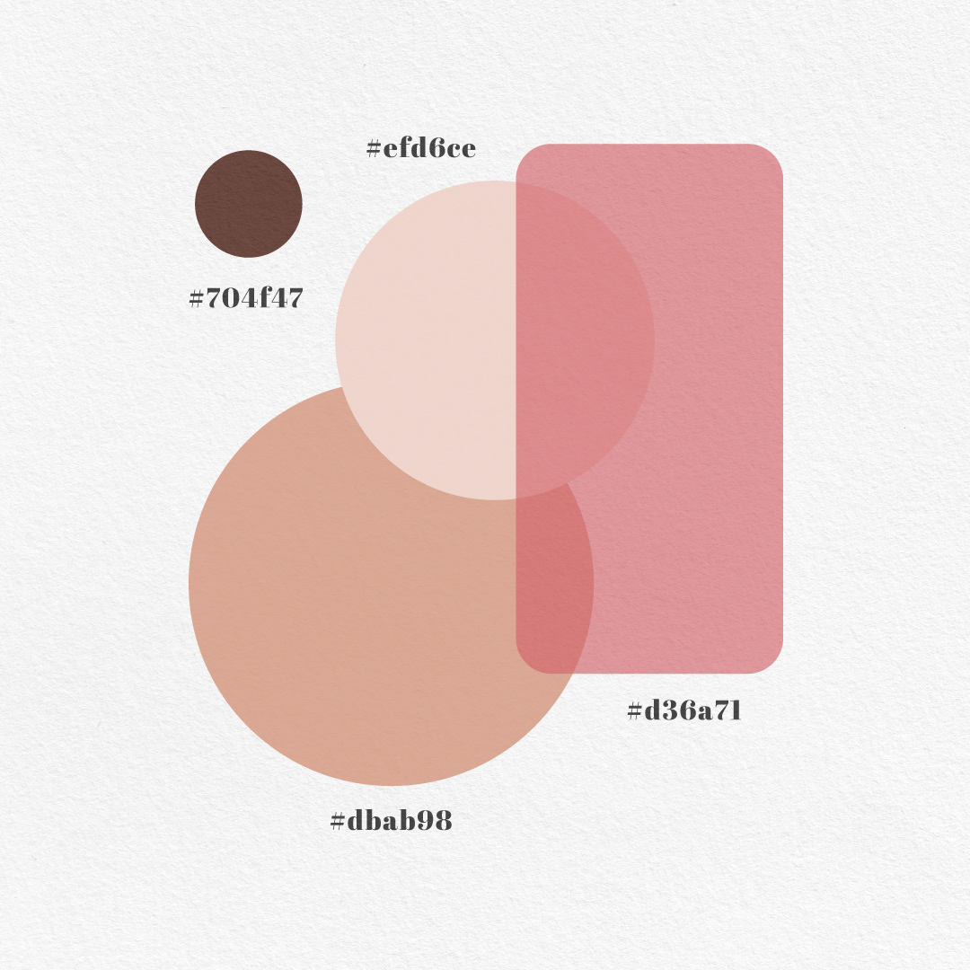
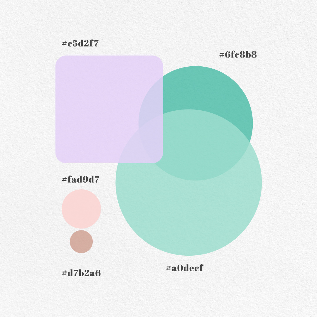
Pastel colors have a unique charm that transcends trends, making them a popular choice in logo design. Their soft, muted tones evoke feelings of calmness, elegance, and approach - ability, which can help a brand stand out in a competitive market. Whether you're designing for a modern tech start-up or a boutique bakery, pastel colors can add a distinctive touch that resonates with audiences. Here’s why pastel colors are a powerful choice for logo design and how to use them effectively.


1. Subtle Sophistication:
Pastel shades, such as soft pinks, baby blues, mint greens, and gentle lavenders, exude an understated elegance. These colors are less overpowering than bold, primary hues, allowing the logo to feel refined and sophisticated.
2. Emotional Connection:
Pastels often evoke positive emotions, including serenity, warmth, and nostalgia. Brands aiming to create a friendly and trustworthy image can leverage these emotional connections to attract their target audience.
3. Versatility Across Industries:
While pastels are commonly associated with feminine or whimsical brands, their versatility makes them suitable for a range of industries, from beauty and fashion to wellness, hospitality, and even technology.
4. Modern Aesthetic Appeal:
Minimalist design trends have embraced pastel palettes as a go-to choice for creating fresh, contemporary aesthetics. These colors pair beautifully with clean lines and simple typography, enhancing a brand's modern appeal.
How to Effectively Use Pastel Colors in Logo Design:
1. Balance with Neutral Tones:
Pair pastels with neutral colors like white, beige, or gray to create a balanced and professional look. This ensures that the design remains visually appealing without feeling overly soft or washed out.
2. Play with Contrast:
Add depth and visual interest by combining pastel shades with darker accents. For instance, a mint green logo can pop when paired with charcoal gray text or a bold outline.
3. Focus on Simplicity:
Pastel colors work best when the overall design is clean and uncluttered. Avoid using too many competing elements that could detract from the logo's impact.
4. Reflect Your Brand's Personality:
Choose pastel colors that align with your brand’s values and message. A soft peach tone might convey warmth and friendliness, while a light blue might suggest trust and reliability.
Pastel colors offer a unique way to communicate your brand’s identity with elegance and warmth. Their versatility and timeless appeal make them a powerful tool for designers seeking to create logos that stand out and connect with audiences on an emotional level. When used thoughtfully, pastel palettes can elevate your logo design and leave a lasting impression.
Are you ready to bring your brand to life with a pastel-inspired logo? Let’s create something beautiful together!
