
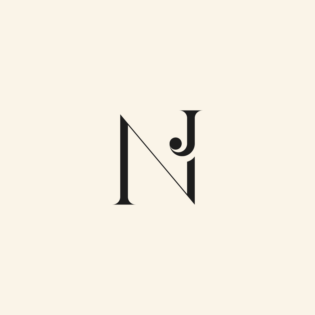
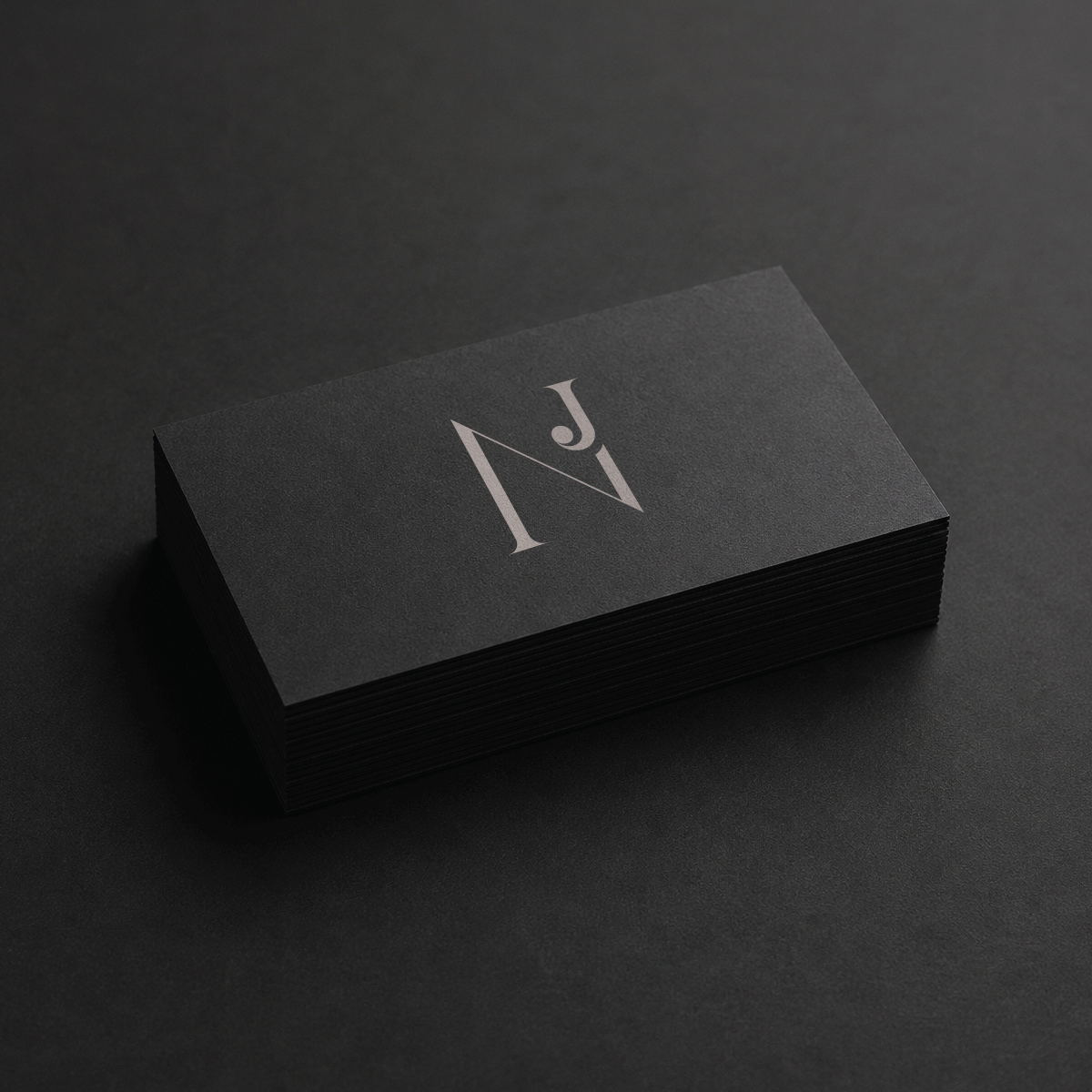
An elegant monogram built on the dialogue between structure and expression.
1. The Problem
Many monograms rely on decorative elements or complex letter arrangements to create distinction. The challenge was to design a mark that feels elegant and memorable while maintaining visual simplicity and long-term versatility.
The monogram needed to communicate sophistication, clarity, and individuality without sacrificing readability or balance.
2. The Idea
The concept was built around the interaction between two contrasting letterforms.
Rather than treating the initials as separate elements, the goal was to create a unified composition where both letters coexist naturally within a single visual structure.
A subtle decorative accent was introduced to add personality while preserving the minimalist character of the mark.
3. The Direction
The design combines an elongated, architectural "N" with a refined "J" that acts as a focal point within the composition.
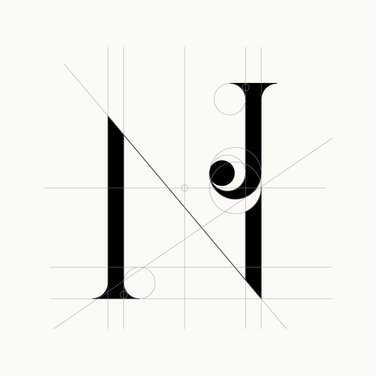
Careful attention was given to proportions, line weight, and negative space to create a sense of visual harmony.
Every element was reduced to its essential form, allowing the monogram to feel timeless rather than trend-driven.
4. The Outcome
The result is a distinctive monogram that balances restraint with character.
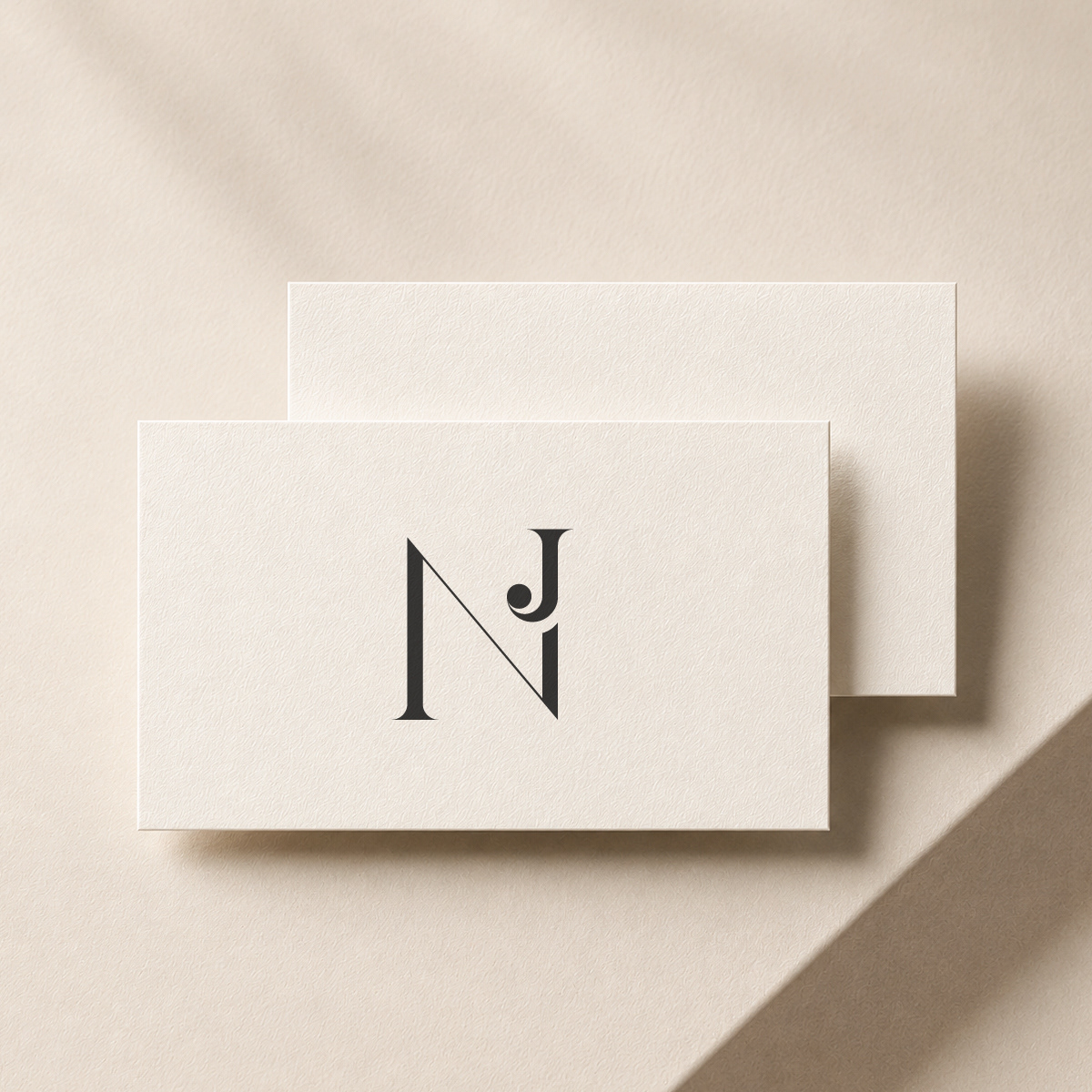
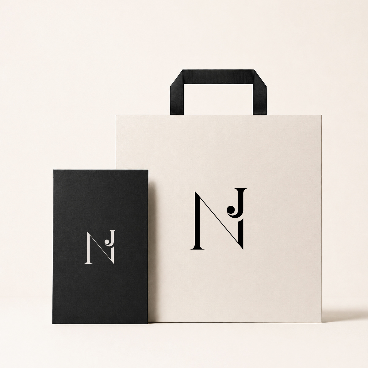
Its clean structure ensures clarity across both digital and print applications, while the unique interaction between the initials creates a memorable visual signature.
The mark feels elegant, confident, and adaptable across a wide range of brand touchpoints.
5. Visual Language
• elegant letter interaction
• architectural proportions
• refined contrast
• intentional negative space
• subtle decorative detail
• elegant restraint
• quiet luxury aesthetic
• strong visual recognition