
A minimalist logo design focuses on simplicity, clarity, and timeless aesthetics. By reducing visual elements to their essentials, minimalist logos create strong brand recognition and communicate a refined, modern identity.
What Is a Minimalist Logo
A minimalist logo is built using simple shapes, clean typography, and a limited colour palette. The goal is not to remove meaning, but to distill it into its most essential form.
Unlike complex designs, minimalist logos rely on balance, spacing, and subtle details to create a strong visual identity. This makes them highly versatile and easy to recognize across different platforms.
Why Minimalist Logos Work
Minimalist logos are effective because they are:
- еasy to recognize and remember.
- associated with luxury and sophistication.
- timeless rather than trend-driven.
Simplicity allows the brand message to stand out without distraction, which increases memorability and trust.
- еasy to recognize and remember.
- associated with luxury and sophistication.
- timeless rather than trend-driven.
Simplicity allows the brand message to stand out without distraction, which increases memorability and trust.
Focus on Simplicity:
Keep the design clean and uncluttered.
Avoid excessive details, gradients, or embellishments.
Stick to basic shapes, clean lines, and balanced composition.
Avoid excessive details, gradients, or embellishments.
Stick to basic shapes, clean lines, and balanced composition.
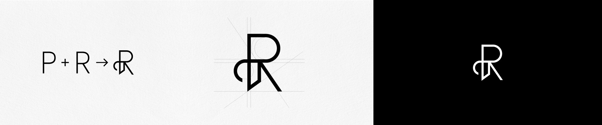
Key Elements of a Minimalist Logo
1. Clean Typography
Typography is often the core of a minimalist logo. Serif or sans-serif fonts should be carefully selected to reflect the brand personality-elegant, modern, or refined.
Typography is often the core of a minimalist logo. Serif or sans-serif fonts should be carefully selected to reflect the brand personality-elegant, modern, or refined.
2. Limited Colour Palette
Most minimalist logos use one to three colours. Neutral tones, black, white, or soft palettes create a calm and premium feel.
Most minimalist logos use one to three colours. Neutral tones, black, white, or soft palettes create a calm and premium feel.
3. Use of White Space
White space is not empty-it creates balance and highlights the main elements of the design.
White space is not empty-it creates balance and highlights the main elements of the design.
4. Simple Forms
Geometric shapes or monogram letters are often used to create clarity and structure.
Geometric shapes or monogram letters are often used to create clarity and structure.
Step-by-Step: How to Design a Minimalist Logo
Step 1: Define the Brand Identity
Start with the brand’s values, audience, and positioning. A minimalist logo should reflect clarity in the brand itself.
Start with the brand’s values, audience, and positioning. A minimalist logo should reflect clarity in the brand itself.
Step 2: Gather Inspiration
Create a focused mood board with examples of typography, layouts, and styles that align with the brand.
Create a focused mood board with examples of typography, layouts, and styles that align with the brand.
Step 3: Simplify the Concept
Remove unnecessary elements. Keep only what supports the message.
Remove unnecessary elements. Keep only what supports the message.
Step 4: Choose Typography and Layout
Experiment with spacing, alignment, and letterforms. Even small adjustments can change the entire feel.
Experiment with spacing, alignment, and letterforms. Even small adjustments can change the entire feel.
Step 5: Refine and Test
Check how the logo looks in different sizes and applications-packaging, website, social media.
Check how the logo looks in different sizes and applications-packaging, website, social media.
Every Logo Should Be a Vector Design:
A vector design is made up of paths defined by mathematical equations, not pixels. These paths allow for smooth scaling and precise detailing, making vector graphics ideal for logos, illustrations, and branding materials. Common file formats for vectors include AI (Adobe Illustrator), EPS, and SVG.
Looking for a custom minimalist or monogram logo?