
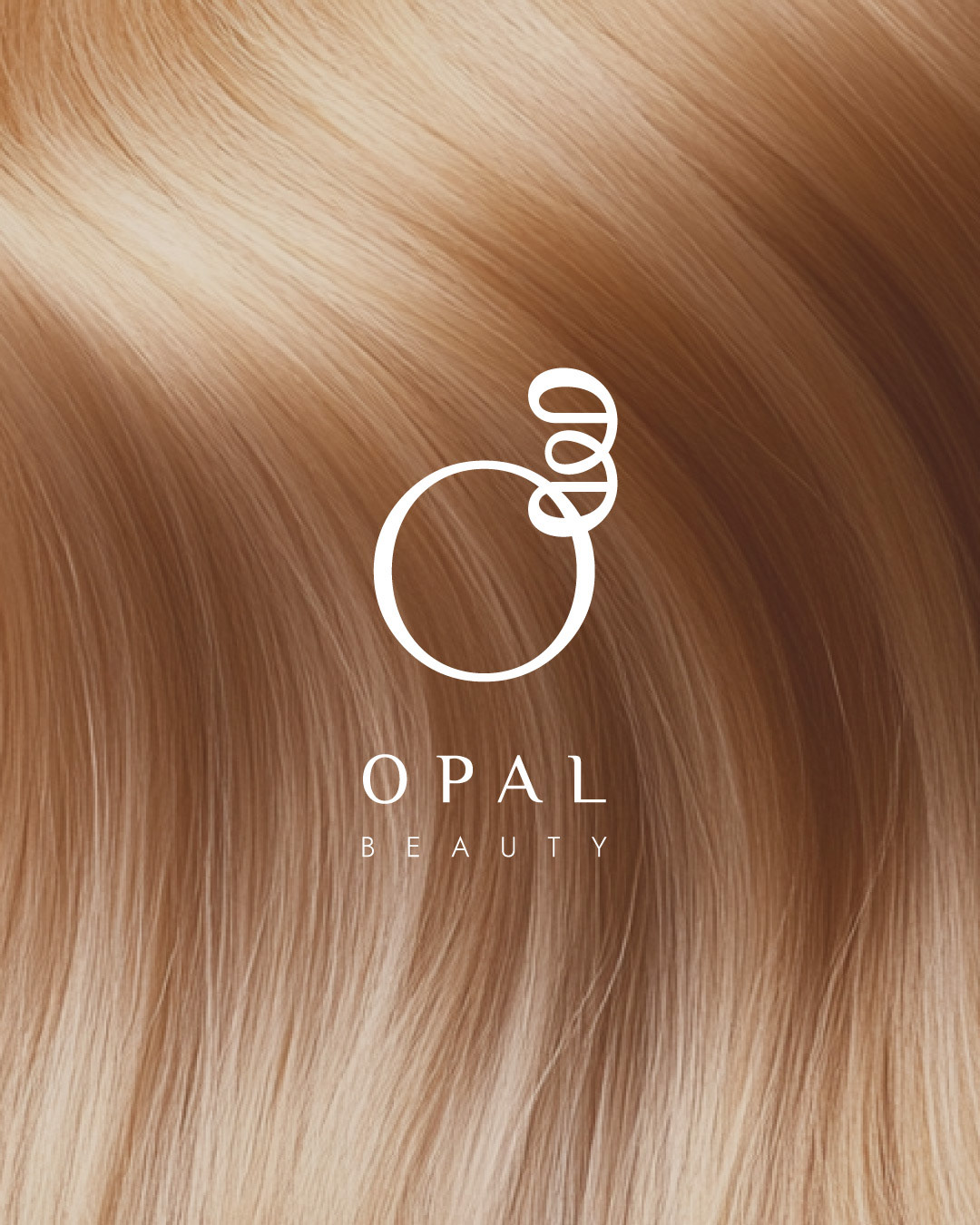
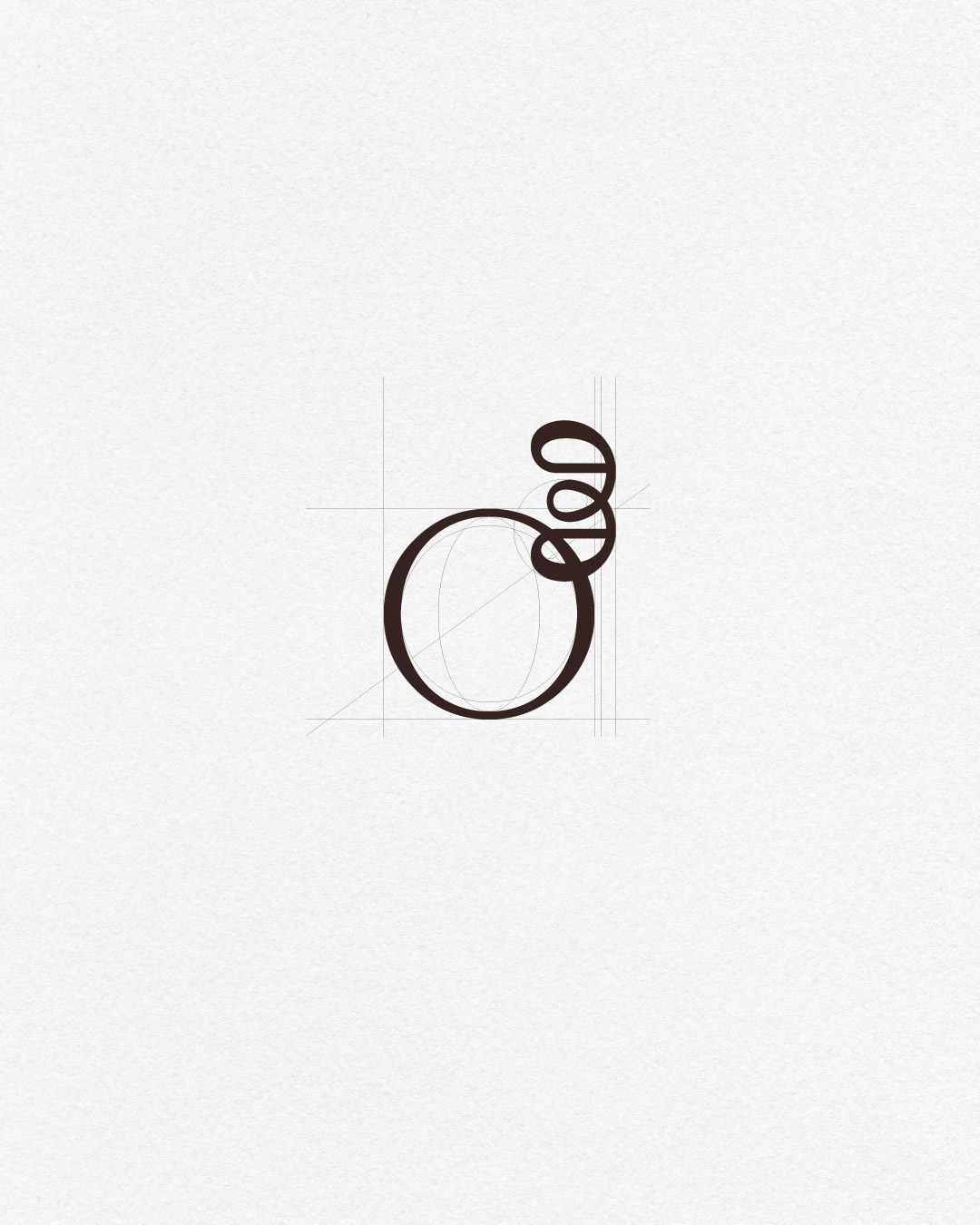
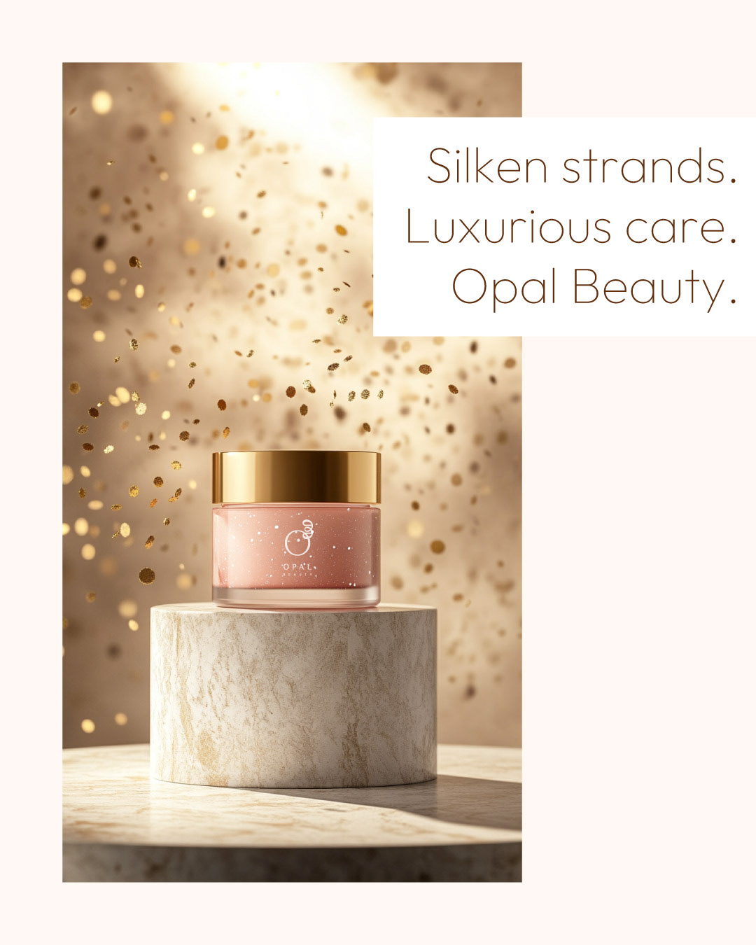

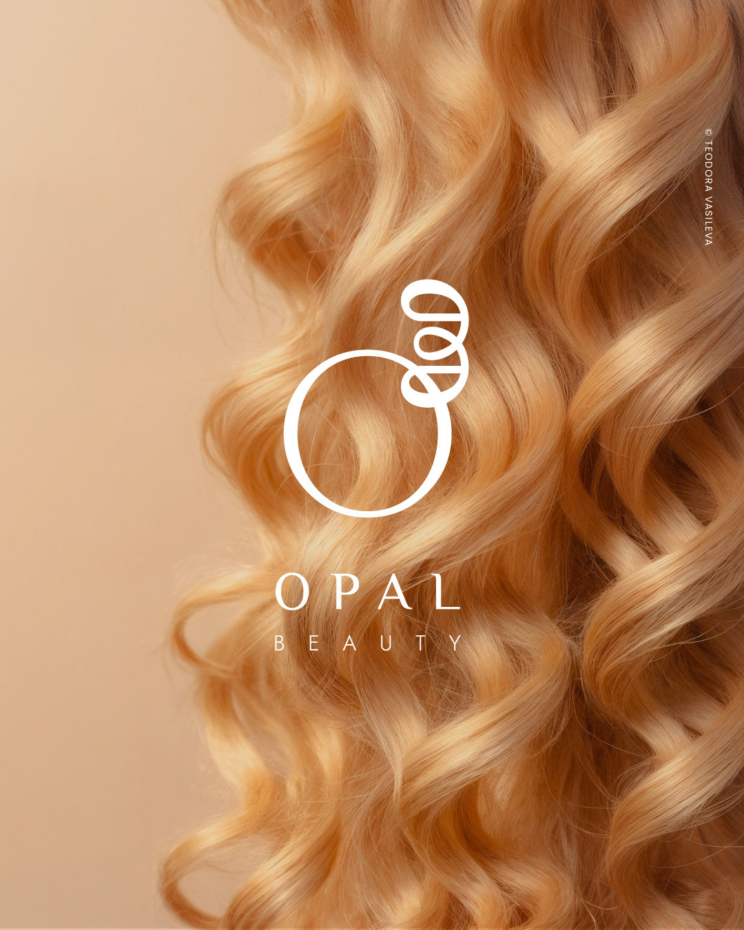
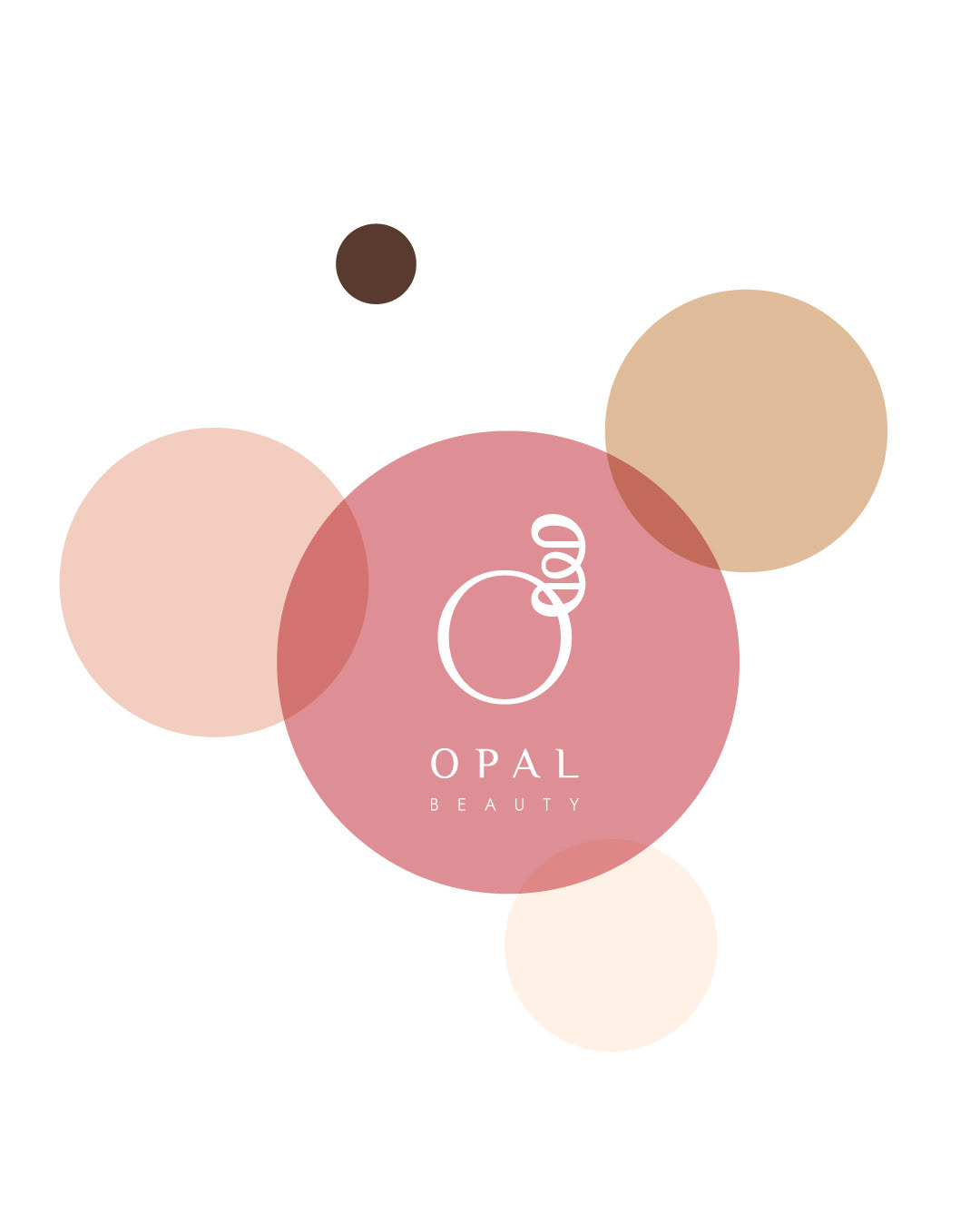
OPAL Beauty is built around a sense of grounded elegance, quiet confidence and thoughtful care. The visual language brings together soft textures, refined forms and a calm, tactile quality.
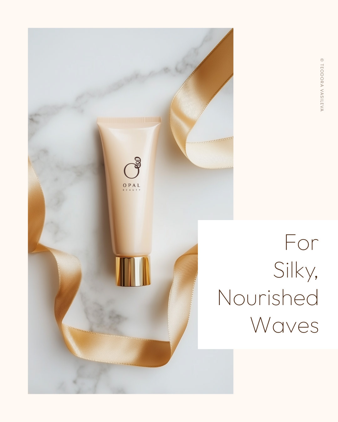
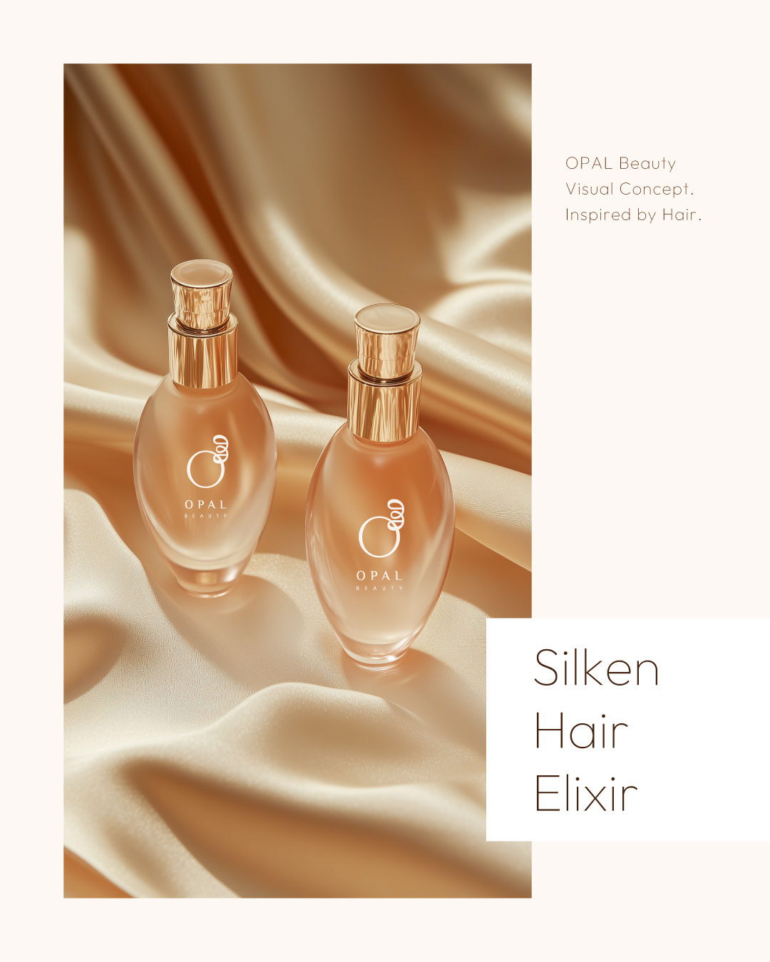
The identity extends beyond the logo into a complete visual communication system for a modern haircare brand. Product imagery, typography and composition work together to express the sensory nature of the brand - from the softness of freshly washed hair to the subtle movement of silk.
The result is a cohesive and understated visual presence, designed to communicate care, refinement and quiet confidence across the brand’s communication.
Need something similar?
I can help you with:
• Brand identity
• Logo design
• Brand guidelines
• Social media design
• Print materials
• Packaging
• Logo design
• Brand guidelines
• Social media design
• Print materials
• Packaging